Kinetic
Kin Insurance's design system
Kinetic is the design system I started at Kin in June 2022 and led until February 2026. It gives Kin’s teams one set of components, styles, and docs for internal tools and customer-facing apps.
What the team built
I wrote much of the code and led the team that grew it.
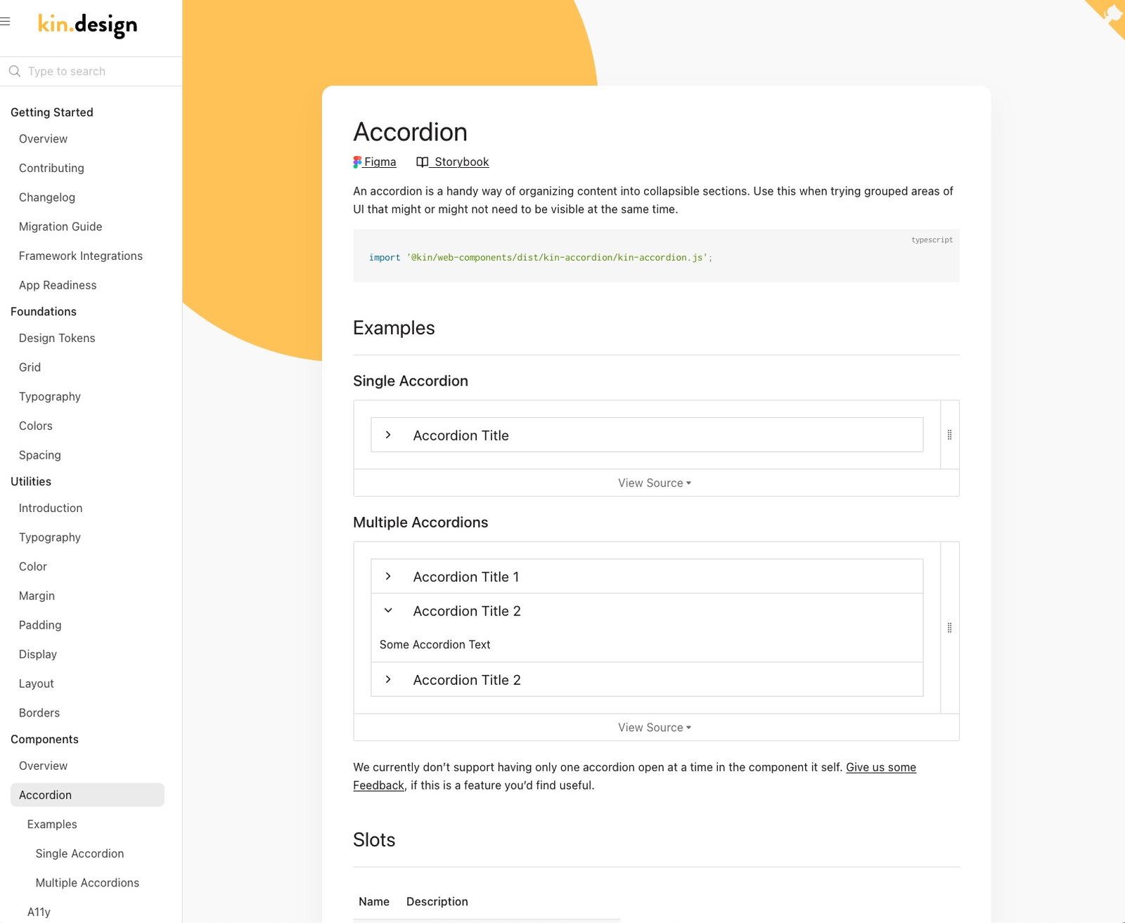
- @kin/web-components: 20+ Lit web components, including accordion, dialog, drawer, tabs, toast, tooltip, file uploader, address autocomplete, and a query builder. They ship as separate internal and external sets.
- @kin/css: a CSS framework with tokens, utilities, layout objects, and themed stylesheets.
- @kin/tokens (built with Style Dictionary), @kin/icons, and a shared Stylelint config.
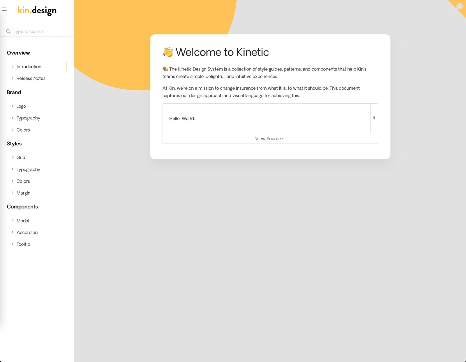
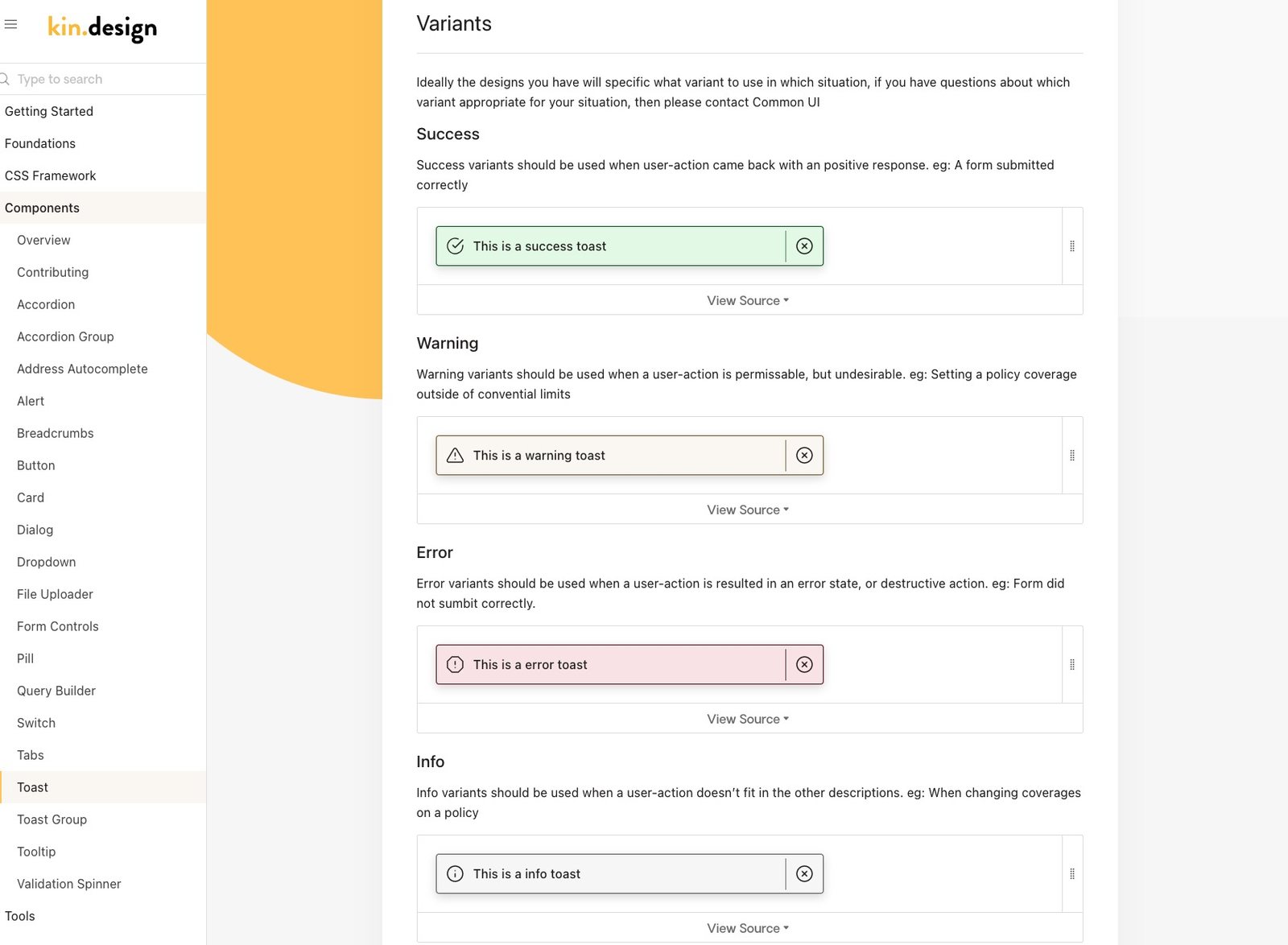
- kin.design: the docs site, with live examples, usage guidance, API tables, a changelog, and adoption metrics. It started on Docsify and moved to Astro Starlight in 2025.
- Tooling: a Lerna monorepo with Plop scaffolding for new components, lint and test CI, Storybook, and versioned publishing to GitHub Packages.
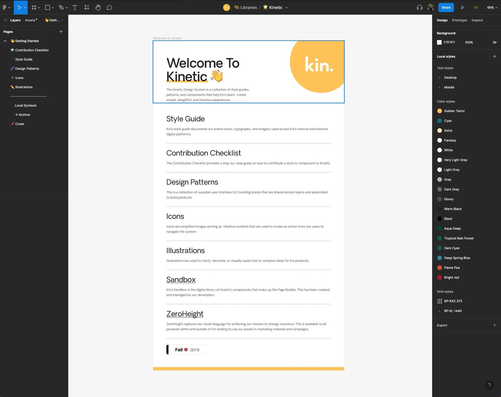
- Process: a contribution workflow, component request templates, and the Kinetic Figma library.
Adoption
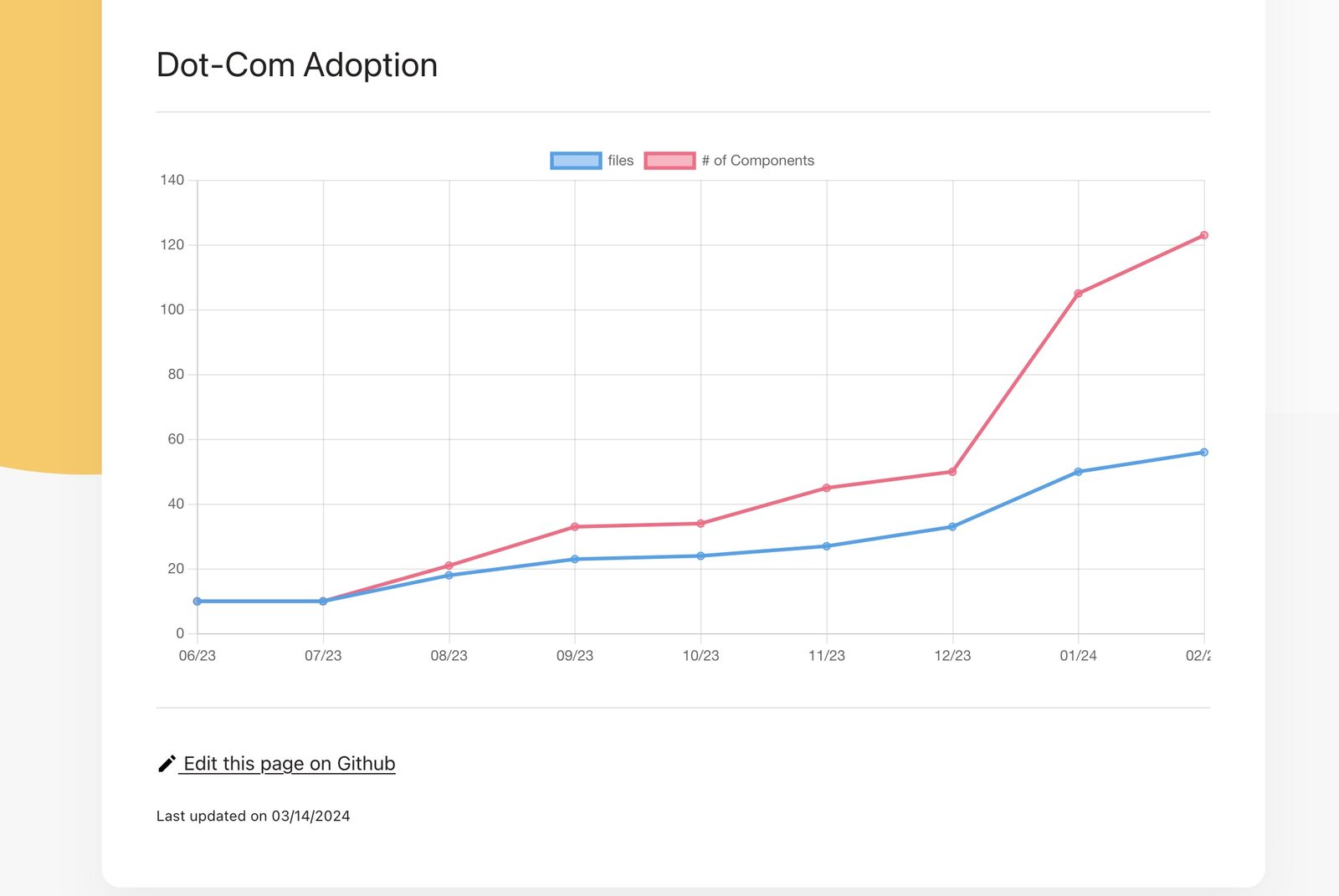
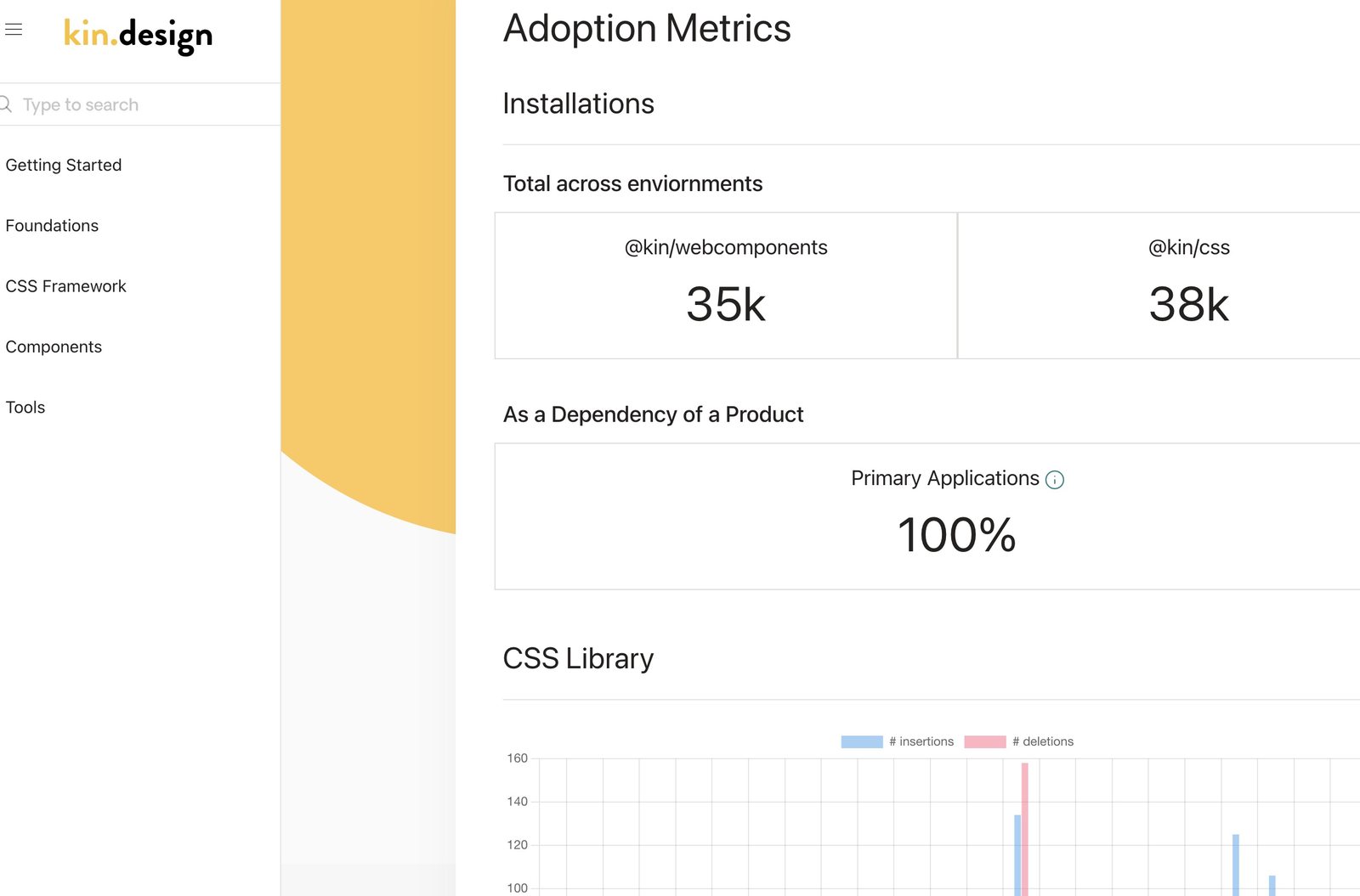
The docs site tracked how much Kinetic was used across Kin’s apps. By March 2024, every primary application depended on it.
Color
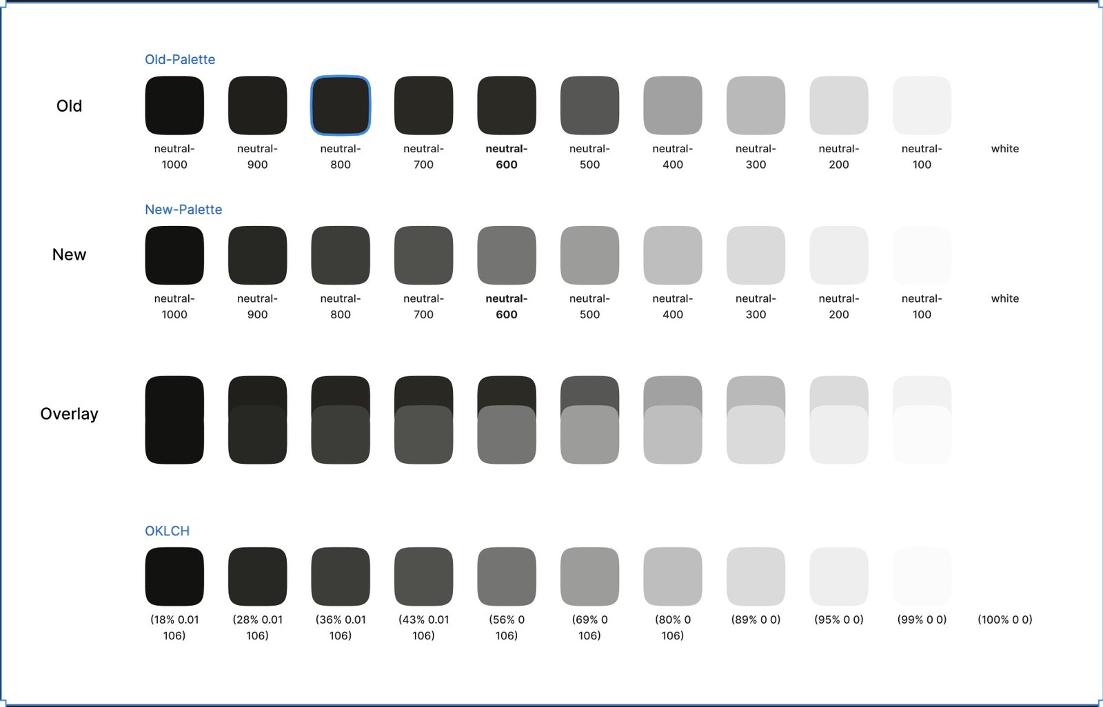
In 2025 I rebuilt the neutral palette and moved the ramps to OKLCH.